Perfectio Formae
2014
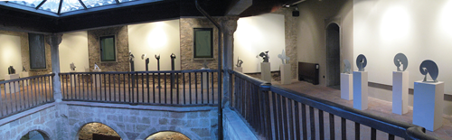
PEDRAGOSA, POET OF GEOMETRY
The latin expression Beta Albuixech used to name this exhibition is a really great choice, not only because it is one of those expressions Joan Pedragosa used to like but also because, as you will discover when visiting the halls of the Palau de l’Abadia de Sant Joan de les Abadesses, the perfectio formae –i.e. perfection of form- was the motto that guided the work of this artist who is known more as a pioneer graphic designer than as an explorer of three-dimensional shapes.
It’s true that Pedragosa was a key figure within the generation of the 60s of last century which promoted a revolution in the world of graphic communications that would change the boring advertising schemes that then prevailed for attractive graphic proposals, full of force and innovation both in form and background . But it is undeniable that its contribution to the graphic design field lies on his constructive skills, that show in all of his works , and that ended making him an expert in packaging design, which he taught in Massana and Elisava colleges. In fact, if we look at the whole of his graphic production , including posters, catalogs, book covers, logos, fonts, alphabets , cutouts, etc.., and even at his interior design projects, we see that all works follow geometric rationality and his modus operandi responded to his need of structuring everything he designed. It’s therefore not surprising that in 2002, he chose the title " Geometry as a seduction " to name one of his exhibitions, a choice that did nothing but than confirm his constructive demeanor.
This natural inclination might be attributed to two factors, one directly related to the training he received from technologist Pere Casajoana in his hometown Badalona in the fields of technical drawing and industrial design, and a second one that took him to Lausanne, where he had the privilege of working during 1960-1962, at the time when the Swiss school of design was stretching the limits of the German Bauhaus’ graphic schemes and setting austere and essentialist expressive codes - walking away from the advertising rethorics of the 50s, which were as picturesque as communicatively inefficient- which would impact his Mediterraneanly emotional work.
If this intention of ordering, articulating and creating his own shapes on plane and space is already visible in a few catalogs in 1958, in posters like the 1960 Fira de Mostres or in brands like the one he designed for Fogo in 1961, it is in the articulated cut-outs, mobiles and volumetric designs that he made from 1964 onwards, where this way of working becomes obvious, a way of working that would become increasingly complex after 1970, and evolved naturally into sculpture. A sculpture that was dominated by minimalist rigor, which he made in aluminum, brass, zinc and steel, developing pure, naked shapes, combining straight lines and curves in a subtle harmonic dialogue, which, like the rest of his work, is not devoid of poetry, a strong sense of color and an inescapable metaphysical concern.